|
STAGE BY STAGE |
|
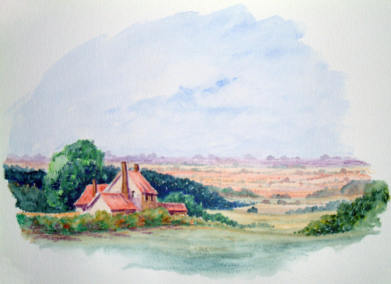
Now let's go to the height of summer. And a slightly more complex outline
drawing this time, but obviously nothing to worry about.
This old cottage is one that I have painted a couple of times in both
watercolours and oils. And so now we'll see how it reacts to the
watercolour pencil treatment.
|
Essential
Supplies
The items you will need to complete this scene are as
follows:-
|
 |
|
|
|
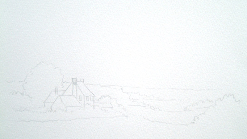
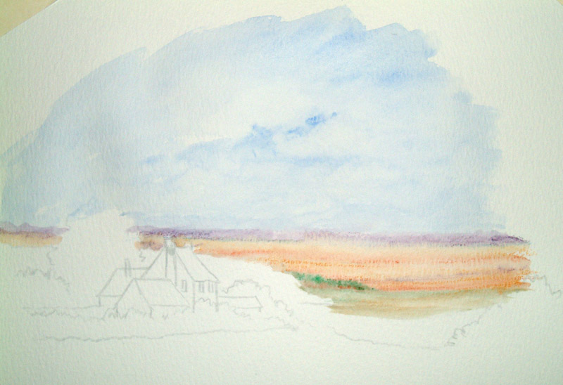
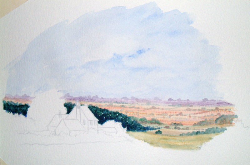
When I say a slightly more complex outline drawing, I mean exactly
that, a few more outlines. Still no shading or fiddling.
I am not particularly bothered what happens at the base of the cottage
because I am going to have a load of bushes there. This painting has a
lot of distance but again it's just outlines.
I am not going to do too much drawing in the far distance as this will
just be a few lumps and bumps giving the impression of far distance. |
|
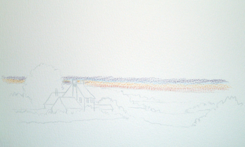
This one consists of mainly drawing in with the colours rather than
taking paint off the pencil. Firstly, for the far distance effect, I am
doing a few lines of purple-grey again not pressing on too hard. Into
this a little coeruleum blue followed by a few touches of yellow ochre
coming slightly further forward. Followed by a few touches of light red,
then yellow ochre. Look at that, what a mess - just like a stick of rock.
But remember I know what’s going to happen (he said hopefully). Coming
further forward I want that yellow to be slightly stronger so I am
changing to raw sienna.
|
|
|
|
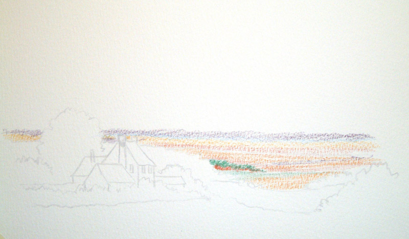
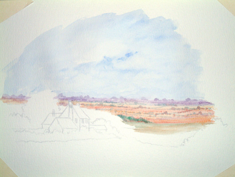
For the clump of trees in the far middle distance I just simply scribbled in
with a little bit of viridian hue and a touch of light red underneath
the green.
The field next to it again raw sienna with a touch of viridian to the
left-hand side underneath the trees, which will help to have a little
bit of shading to that middle distance field.
|
|
Now this is all getting a bit messy and at this stage if you are not
careful you could lose your way a little bit, so I am going to wet to where
I’ve got to so far, and add the sky to transform all that mess into the
picture so far. For the sky we will have a light summery sky. I am going
to start off with a little bit of ultramarine blue taking the colour
off the pencil with my ¾" wash brush, stroking on creating a big
sky. Still with the ultramarine blue slightly stronger for a few cloudy
bits. Again wash out taking a few bits of cloud out. Whilst this is
still wet I’m changing to my No.8 round brush and start to wet the
areas for the distance, starting with the purple. Notice I said “whilst
my sky is still wet” this way I get a light soft effect for my distance
rather than sharp edges.
|
|
|
|
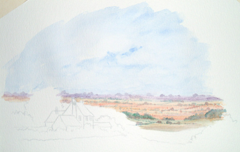
Now using the same colours again, starting with my purple-grey and my
No.8 round brush, I am adding a few lumps and bumps and squiggly bits into
the distance. Changing to a little bit of my Hooker's green, again
stroking paint off the pencil with the point of my No.8 round brush. And
we'll have a few more lumps and bumps, getting slightly stronger as they
come further forward. Here and there, I am also adding a few touches of
light red, to give a little bit more definition to the fields or
hedgerows.
Now with that purple in the far distance, you start to get a lovely hazy
effect giving you much more recession.
Now I’m taking a bit of Hooker's green off my pencil with my No.8 round
brush for some bushy trees, slightly nearer which of course means
slightly stronger. And again a few lumps and bumps into this area. Now
can you see what I mean by you’ve potentially got a chance of getting
lost, whereas now you can see the start of a picture. |
|
This needs to dry slightly before I start drawing again into the big
chunky foreground areas, such as the cottage and middle distance
woodland. |
|
|
|
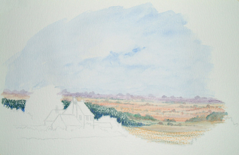
Now I’m going back to drawing on with my pencil, and as strange as it may
seem, I’m making this middle distance clump of trees darker than I have
the foreground.
Now underneath that clump of trees I'm going on with a little bit of
yellow ochre,
good
and strong, and a touch of my Hooker's green stroked in
amongst this. At the base of the trees I’ve also added a tiny touch of
ultramarine blue to darken even more. |
|
Now for the water, and rather than painting the water on I am just
daubing on in a stippling motion just to give a little bit more texture
as this also leaves some dry bits of pencil showing through here and
there. Now the depth and darkness of this clump of trees is going to
really make the foreground areas stand out. At the same time of doing
this I am also wetting that middle distance field and adding a couple of
little lumpy bits here and there with Hooker's green to break up the
line.
|
|
|
|
The cottage itself is going to be a fairly light colour, so I am stroking
on first very gently with a little bit of raw sienna then a little bit
of cool grey on top of this. For the front part of the building it's
again raw sienna but this time with a touch of Vandyke brown, you will
see that I have also put a bit of Vandyke brown on the chimneys and for
the roof, light red and simply fill it in and yet again what a mess. |
Wet the building merging all the colours, then whilst it is still wet
with a dry pencil add a few touches of purple-grey here and there. This
will help highlight the windows and add nice dark shadows where the roof joins
the building, but interestingly enough I’m not going to wet these down,
just going into the already wet building with a dry pencil.
|
|
|
|
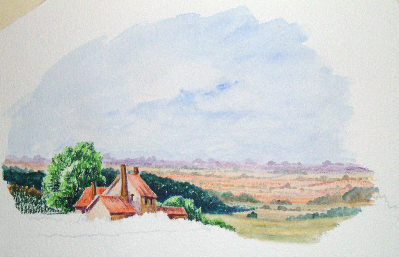
Now it's back into the scribbling bits for the close foreground trees.
For this I am using vivid green to start with, then a little bit of
Hooker's green dark in amongst this. Then here and there a few touches
of indigo, mainly where the trees meet the building so that I can get it
really dark where one meets the other, this will again serve as a frame
to push the building forward.
For the bushy bits to the left of the main tree behind the house I've
added a few touches of raw sienna to the top area just to lift it
slightly. |
Now it's time for the water, merging the dark colours near the
house up into the main part of the tree ensuring that I am keeping those
colours near the house really dark and rich. You see now how that big
clump of trees in the middle distance pushes all this stuff further
forward.
|
|
|
|
Now into the foreground. Starting off with a bit of yellow ochre for the
little smidgen of field in between the house and the foreground bushes.
Also stick some of this yellow ochre, good and strong, into the top parts
of the foreground bushes. Then in again with viridian
hue
pressing
on hard to make these colours good and strong.
In the foreground field a little bit of yellow ochre with Hooker's green
on top here and there and also some Hooker's green nice and strong on the
little bit of bush to the right.
On the top bits of the bushes to the right add a touch of cadmium yellow
just to catch a little bit of light here and there.
|
Now it's time for the final stroke of water, still with my No.8 round
brush. For those bushes under the house, again stippling on rather than
stroking. I'm not going to wet the field behind these bushes, which I painted in yellow ochre.
I am, however, putting plenty of water into the foreground fields; making sure that those colours merge
together.
Now I did say time for the final strokings, but that doesn’t
mean time for the final colour, because again whilst all this is still
good and wet, I'm just going to add a little bit of purple-grey into
those bushes on the left with a dry pencil onto wet paper which is adding a
little bit more depth to this area.
And there we go a lovely little pastel summer scene. |
|